Category:
User Experience / UI Design
Client:
SyncActive


🧠Overview
Task: Design a dashboard that empowers users to monitor their key health and fitness metrics—workouts, heart rate, sleep patterns, and more—in one centralized interface.
Role: Lead UX Designer leading research, ideation, prototyping, and handoff, while mentoring junior designers and collaborating with visual and development teams.
Key Problems: Users struggled with fragmented apps, data overload, and inefficient tracking of their fitness journey. They needed a clean, glanceable experience that presents only essential actionable information.
🔧Process
1. Research & Discovery
User Research: Surveys or interviews identify user goals—tracking workout performance, progress monitoring, and quick glances during exercise.
Competitive Analysis: Benchmarking similar health/fitness dashboards to understand standard features (charts, metrics, activity logs) and spot opportunities.
2. Define & Plan
User Personas & Scenarios: Created target personas (e.g., busy professionals wanting quick dashboard insights mid-workout).
UX Goals: Focus on clarity, ease of use during exercise, prioritized daily metrics, and reducing clicks. This aligns with simplifying navigation and increasing engagement .
3. Ideation & Sketching
Information Architecture: Defined key modules—workout summary, metrics (heart rate, calories), weekly trends, goals and achievements.
Sketches / Low-Fi Wireframes: Explored multiple layouts—card-based vs. list-style—iterating on hierarchy and grouping of health data.
4. Wireframing & Mid-Fi Designs
Card-Based Layouts: Designed interactive cards for each metric and workout segment that can update in real time—e.g., workout details, a “rate workout” screen, and regeneration dialogs (according to designer’s notes).
Comments from Community: Reddit users noted areas to refine visual consistency—suggesting mobile-first design, improved contrast, realistic labels, and hover feedback.
5. High-Fidelity UI Design
Visual System: Introduced a vibrant, fitness-driven color palette, clear typography, and consistent iconography.
Clutter Reduction: Addressed feedback by simplifying background contrast, avoiding repetitive labels, refining font sizes, and enhancing interactive areas .
6. Responsive & Mobile-First Focus
Adaptation to Mobile: Redesigned for mobile screens to support gym use—short interactions, large tap targets, essential metrics visible at glance.
Cross-Platform Consistency: Ensured layouts scale gracefully from desktop dashboards down to mobile.
7. Prototype & Usability Testing
Interactive Prototype: Built in Figma or similar tools—to test flows like starting workouts, rating sessions, viewing trends.
User Validation: Feedback loops revealed needs for better hierarchy, faster access, and visual cues to guide user attention.
8. Accessibility & Optimization
Contrast & Legibility: Adjusted color choices to meet accessibility standards—avoiding pure black text, ensuring clear differentiation.
UI Touch Areas: Refined icon/button sizes to recommended 44–48px for comfortable mobile use
9. Final Screens & Features
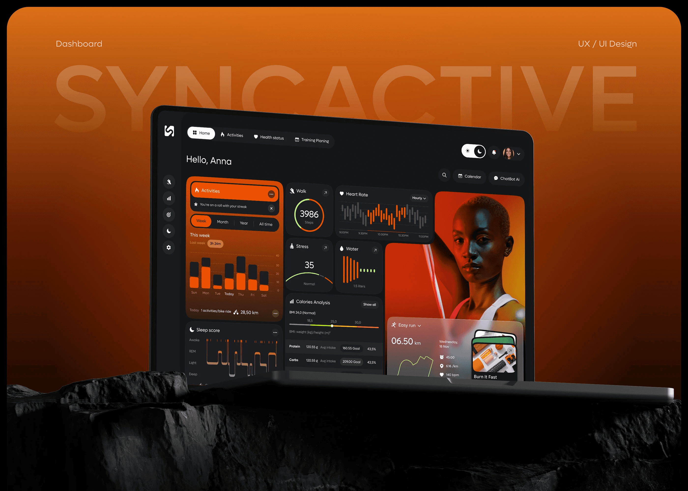
Dashboard Home: A clear overview with key metrics—workouts today, calories burned, weekly streaks.
Workout Detail Screen: Includes “rate workout” option and “regenerate” dialog for plan adjustments.
Trend & Goals View: Weekly/monthly charts to help users track performance over time.
Dialogs & Microinteractions: Subtle animations to confirm actions and improve perceived responsiveness.
10. Launch & Iteration
Design Handoff: Provided annotated specs and interaction guidelines for developers.
Release & Monitoring: Post-launch analytics and user feedback inform continuous improvements—especially adjusting contrasts, typography, and interaction flows.
🎯In summary
This project reflected the blueprints of a thoughtful UX journey—from understanding user habits in fitness contexts, sketching and iterating on layouts, to refining for mobile use and accessibility. Highlights include the “rate workout” and “regenerate dialog” screens, community-informed design tweaks, and smart mobile-first interactions aimed at gym settings .