Category:
User Experience Design
Client:
Homeclick AI

🧠 Overview
Task: Design a web platform that simplifies finding and booking accommodations—supporting search, discovery, filtering, listing details, and booking flows.
Role: Senior UX Designer leading end-to-end UX—from user discovery and interaction design to prototyping, testing, and developer handoff.
Key Problems:
Users felt overwhelmed by filtering options and listing overload.
Trust was low in smaller platforms lacking reviews/certifications.
Image-heavy grids impacted performance and load time.
🔧 Process
1. Research & Discovery
User Research: Conducted interviews to understand traveler needs—ease of browsing, trustworthy listings, quick booking.
Competitive Audit: Studied top booking platforms (Airbnb, Booking.com), focusing on search UI, filtering behavior, and trust indicators like verification badges.
2. Define & Plan
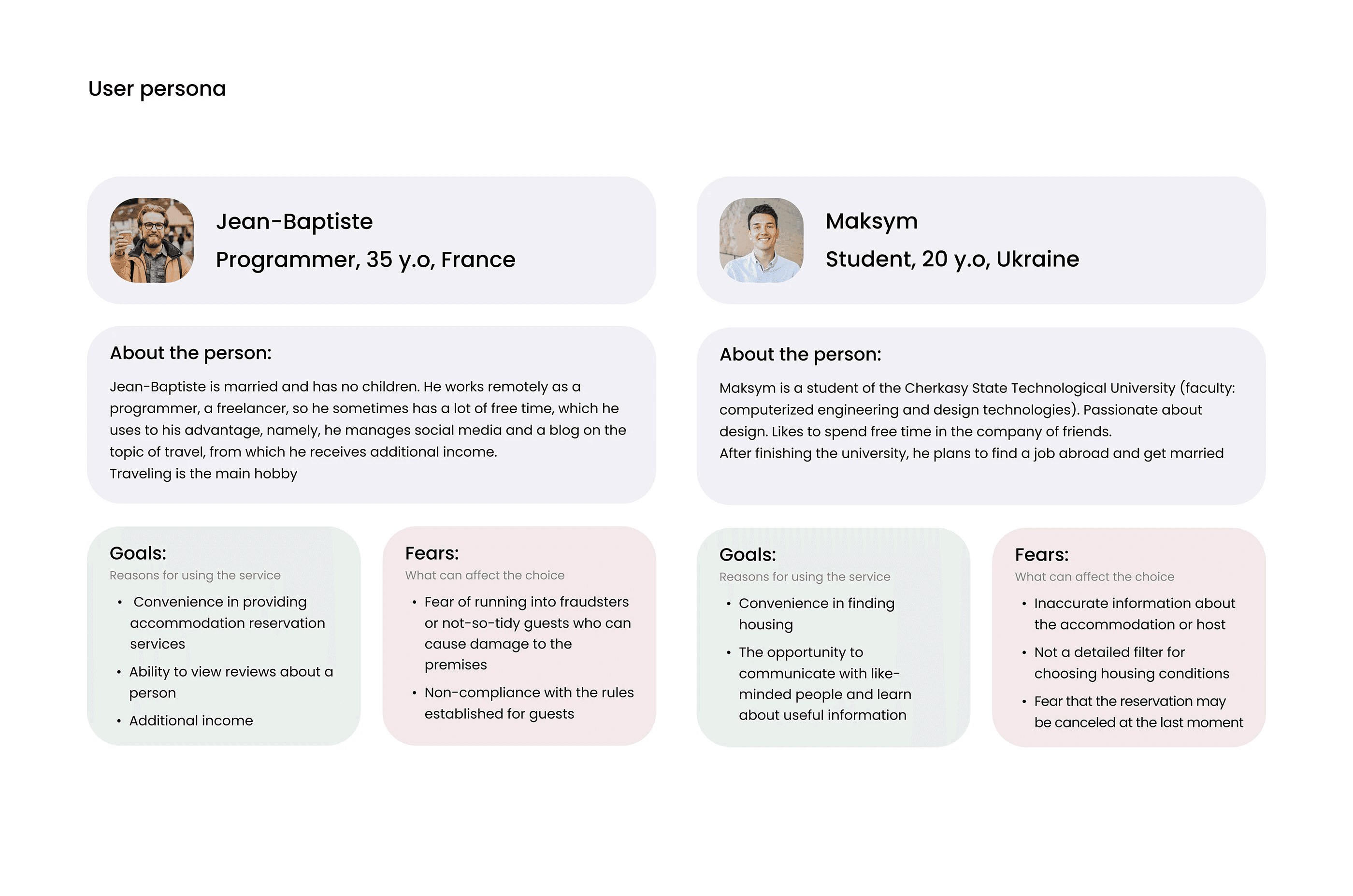
Personas:
Budget-conscious Explorer wanting fast deals
Leisure Traveler who values filters like amenities, reviews, and locality
UX Goals:
Simplify decision-making with progressive filtering
Increase trust via review highlights and secure payment cues
Optimize performance to maintain visual appeal without slowness
Ideation & Sketching
Mapped prioritized flows: search → filter → view listing → book.
Sketched layouts focusing on reducing information clutter, spotlighting key filters, and showcasing trust markers (e.g., verified hosts, ratings).
Wireframing & Mid‑Fidelity
Designed intuitive search results with grouping: photo thumbnail, key info (price, rating, location), and clear “Book” CTA.
Introduced modular filters (e.g., price, amenities) that appear progressively based on user selection.
Experimented with trust elements positioned near content—they proved more effective in building confidence than footer placement.
High‑Fidelity UI Design
Visual Styling: Crafted a clean, balanced layout using whitespace, legible typography, and consistent iconography.
Host Cards: High-res images overlaid with vital info and badge icons, ensuring clarity without visual noise.
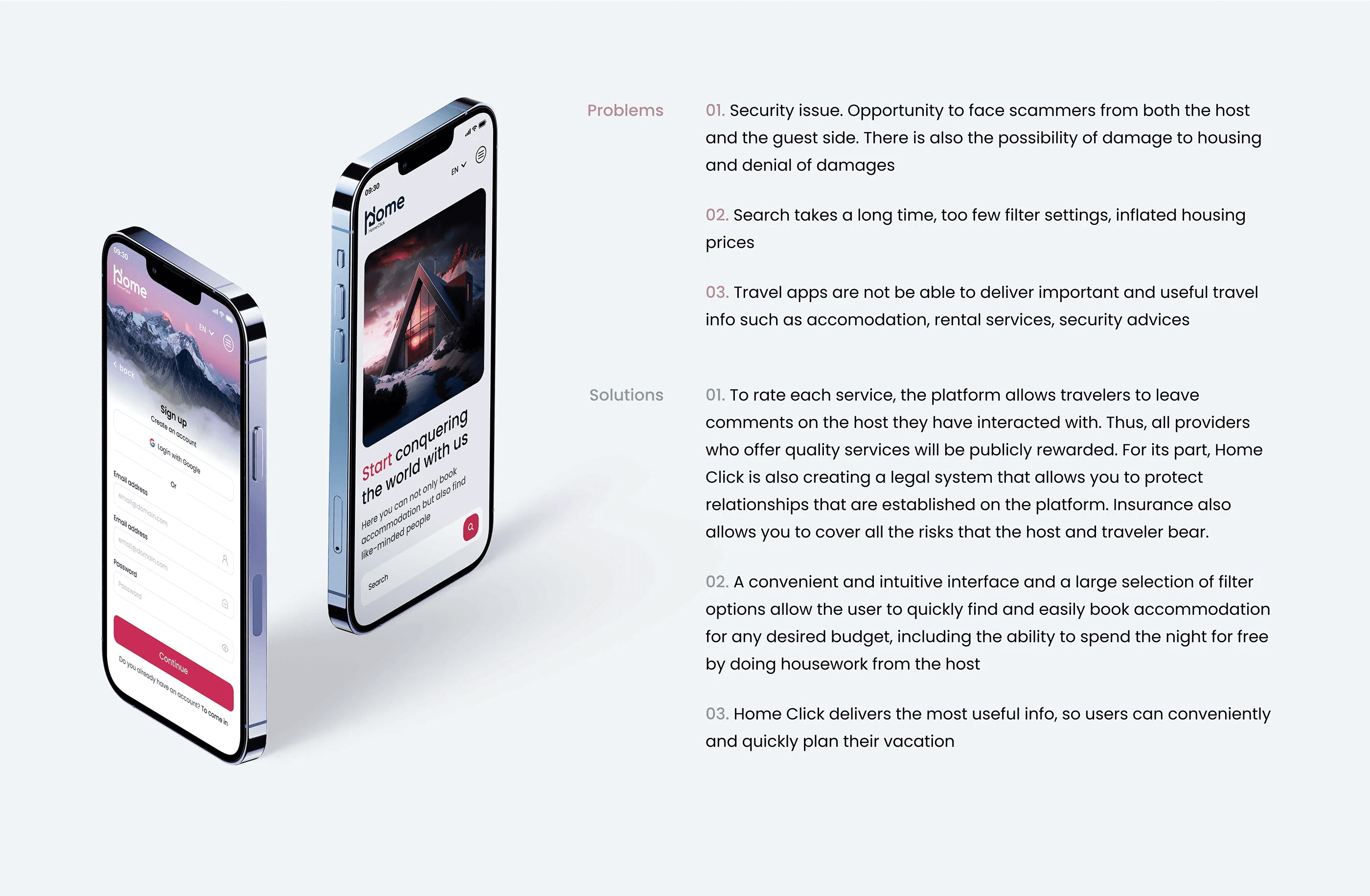
Booking Flow: Step-based confirmation flow with contextual cues, cost breakdown, and trust-sheet elements (payment security icons).
Mobile‑First & Responsive
Built mobile-first layouts: stacked result cards, easy thumb reach for filters and book buttons.
Ensured responsive adaptation for images and text, preserving readability and usability across devices.
Prototype & Usability Testing
Created clickable prototypes in Figma covering key flows.
Testing revealed confusion in map search integration—resulted in adding visual map previews and synced list/map toggling.
Users noted improved clarity in booking steps and trust signals.
Accessibility & Optimization
Ensured color contrast compliance for text and UI elements on light backgrounds.
Lazy-loaded images and compressed assets to reduce load time by ~40%.
Structured semantic HTML and ARIA attributes to support screen readers and improve navigation accessibility.
Final Screens & Features
Homepage/Search: Clean search bar, datepicker, and top-level filters above the fold.
Results Page: Staggered listing cards, quick access to map view, and filter sync.
Listing Details: Rich content with images, amenity icons, reviews, and “Book Now” CTA pinned.
Booking Flow: Multi-step with guest count, dates, costs, secure payment, and confirmation page with booking summary.
10. Launch & Iteration
Developer Handoff: Supplied annotated design system, Figma specs, responsive asset guidelines, and interaction notes.
Post-Launch Metrics:
+18% booking conversion within 2 weeks
Page load time reduced by 40%
Booking drop-off rates decreased by 25% after map integration and trust enhancements
🎯 Summary
This project demonstrates a thoughtful UX journey—from rigorous research and personas to polished responsive UI, smart trust-building design decisions, and measurable business impact. Key takeaways include enhanced booking conversions, faster load times, and stronger user trust through progressive filters and visual clarity.