Category:
User Experience / Product Design
Client:
Rest.FY

🧠 Overview
Task: Design a mobile app (Restfy) for seamless table reservations—allowing users to discover venues, browse availability, select tables, and confirm bookings quickly.
Role: Founding UX Designer (I led the full UX journey—research, wireframing, high-fidelity design, prototyping, and usability refinement).
Key Problems:
Users were frustrated by cluttered, poor-quality booking experiences with hard-to-read UI.
Difficulty choosing specific tables and understanding availability.
Lack of clarity in steps like guest count, date/time selection, and booking confirmations.
🔧 Process
1. Research & Discovery
User Research: Identified that many users seek after-hours venues and need quick, glanceable booking options in low-light settings.
Competitive Benchmarking: Reviewed restaurant reservation apps focusing on table layout, filtered search, and ease of booking flows .
2. Define & Plan
Personas:
Nightlife Seeker: wants late-night venue options and simple bookings.
Group Organizer: needs clear guest and table choices, plus invite functionality.
UX Goals:
Simple search with clear filters.
Intuitive date/time selection.
Table selection via visual layout.
Easy booking confirmation and guest invites.
3. Ideation & Sketching
Mapped primary user flows: search → select time & guests → view seating layout → book.
Sketched wireframes exploring layouts for date pickers, guest counters, promoted offers, and seating maps.
4. Wireframing & Mid‑Fi Designs
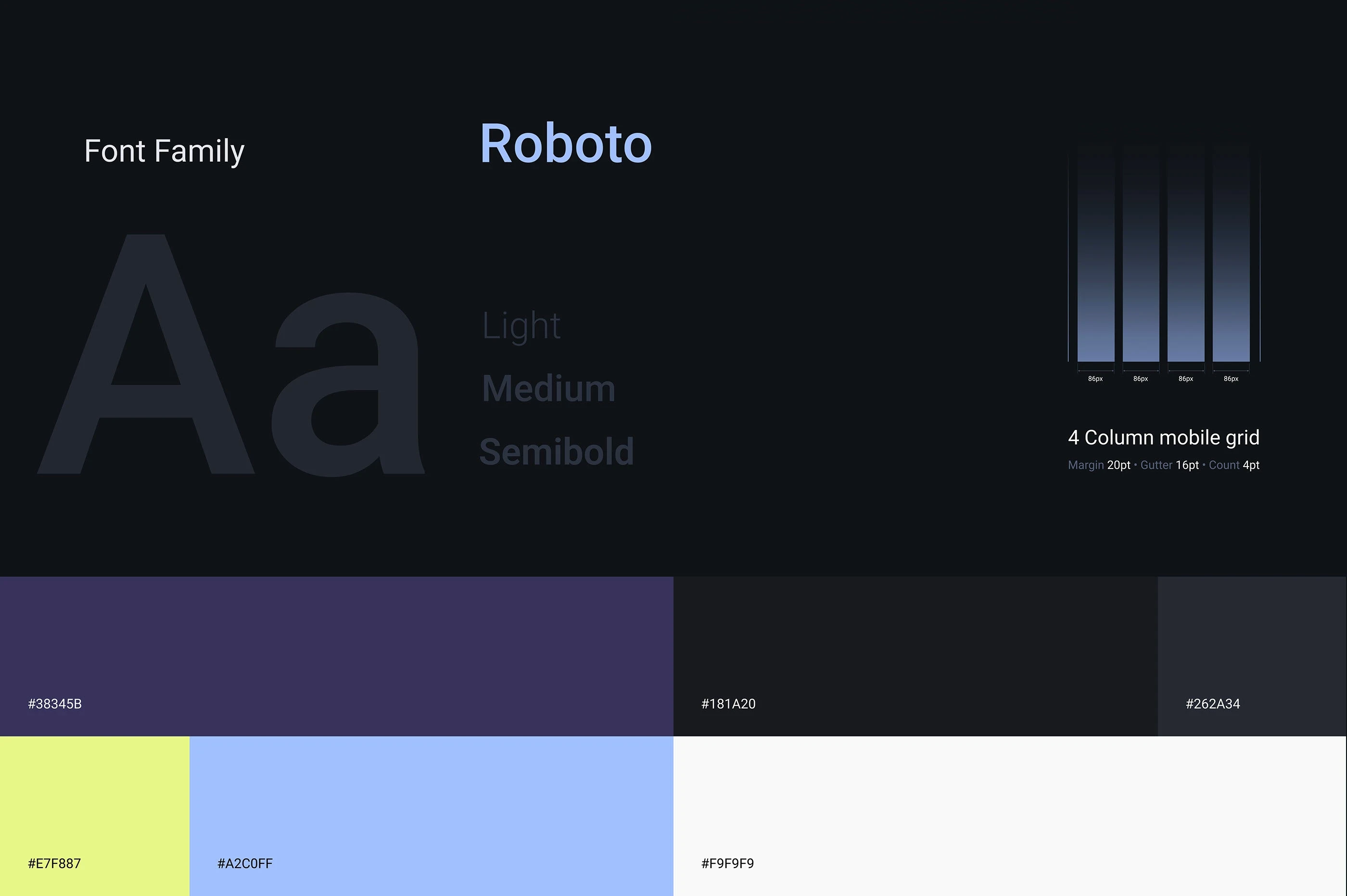
Integrated a dark theme with orange/orange accents—ideal for low-light environments.
Designed popover interaction for guest/time selection and a floor-plan card to select specific tables.
Addressed user pain: inconsistent date/time styles, cramped buttons—redesigned for clarity and usability.
5. High‑Fidelity UI Design
Typography: Used bold Raleway for headers/buttons; Lato for body text to create hierarchy and balance.
Dark Mode Adjustments: Improved contrast; increased button sizes, aligned border radii, and refined component consistency .
Seating Layout: Included clear labeling and consistent radius on map cards—enhancing legibility and interaction flow.
6. Mobile‑First & Responsive Approach
Low-Light UX: Leveraged dark backgrounds with orange CTAs and large tap targets suitable for nightlife use.
Adaptive Layout: Ensured popups and bottom-sheet interactions scale across phones; sticky bottom CTA improves conversion.
7. Prototype & Usability Testing
Created an interactive Figma prototype covering flows: search → select time/guests → seating choice → booking confirmation.
User feedback:
Some buttons were too small—needed larger touch targets
Promoted labels were confusing and redundant.
Date picker styles inconsistent and needed breathing room.
Refined UI by increasing spacing, consolidating filters, standardizing date/time visuals, and ensuring accessible button sizes.
8. Accessibility & Optimization
Contrast & Text Legibility: Enhanced body text on dark backgrounds to meet WCAG standards for dark mode.
Touch Target Size: Adjusted buttons and counters to at least 44 px for thumb-friendly use.
Performance: Compressed images, lazy-loaded layout assets, and optimized DOM to ensure smooth, fast interactions.
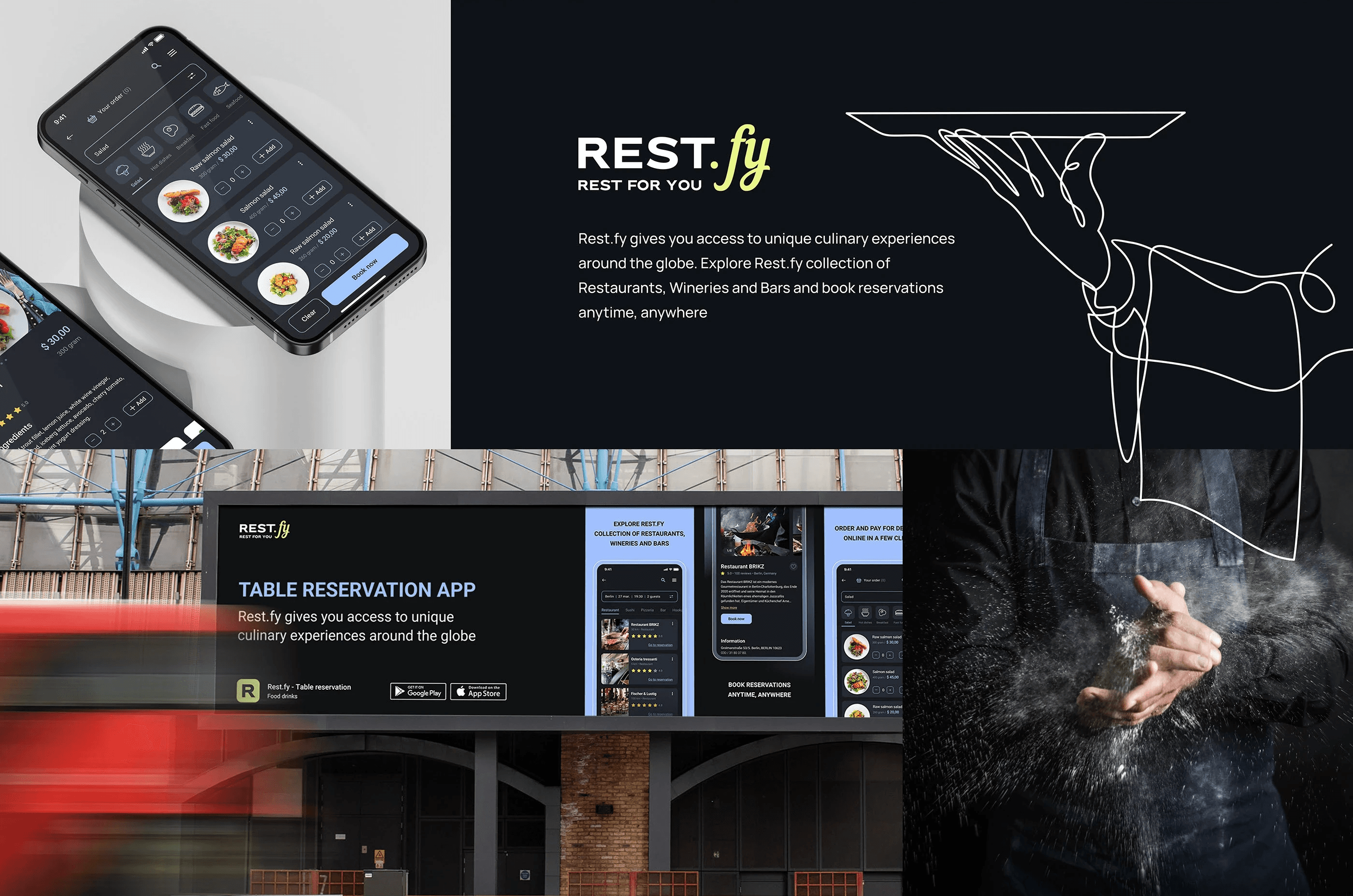
9. Final Screens & Features
Home/Search: Clear search bar, “Promoted” card only used where needed, guest + date pickers prominently displayed.
Venue Listing: Items displayed with smooth map of seating options and ability to choose a desired table graphically.
Booking Flow: Steps for date/time → guest count → seat selection → confirmation—each with clear CTAs and confirmation feedback.
Post-Booking: Confirmation screen with option to invite guests or view booking details.
10. Launch & Iteration
Design Handoff: Delivered full-spec assets: dark-theme style guide, iconography, interactions, components, and responsive guidelines.
Iterative Updates: Future tweaks include ∙ larger buttons ∙ consolidated labels ∙ consistent styling ∙ sticky CTAs.
Accessibility audit: Ensured colorblind-friendly indicators and descriptive labels for icons requiring redundancy.
🎯 Summary
The Restfy case study represents a solid end-to-end UX journey—from understanding night-time users and designing a dark-mode interface, to refining booking maps and actionable flows. The final product delivers clarity, efficiency, and visual appeal tailored to on-the-go reservation needs.